
UX Strategy · Dashboard Design · Internal Tools · B2B/B2C
Designing for Throughput: Order Entry Infrastructure at Ares Sportswear
When incremental checkout improvements drove a measurable spike in conversion at Ares Sportswear, the volume of incoming orders exposed a critical inefficiency hiding in plain sight — the internal order entry workflow was quietly becoming the bottleneck. I redesigned the order entry dashboard over eight weeks to consolidate a fragmented, navigation-heavy process into a single, self-contained tool built around how order processors actually work.
Context
The Catalyst
Ares Sportswear is a B2B/B2C custom apparel and sportswear retailer in Columbus, Ohio that predominantly serves academic sports teams with custom print, embroidery, and online team store hosting. I joined the team to lead design for the client-facing platform — specifically to resolve critical usability failures in the checkout funnel.
As incremental, low-lift updates to the checkout experience rolled out, conversion rates climbed. And as order volume increased, a problem that had been manageable at lower scale became impossible to ignore: the internal order entry workflow was not built to keep up.
More orders moving through the funnel meant more orders landing on account managers' plates — and the tool they used to process those orders was actively working against them. What started as a client-facing project expanded its scope the moment the backend started showing strain.
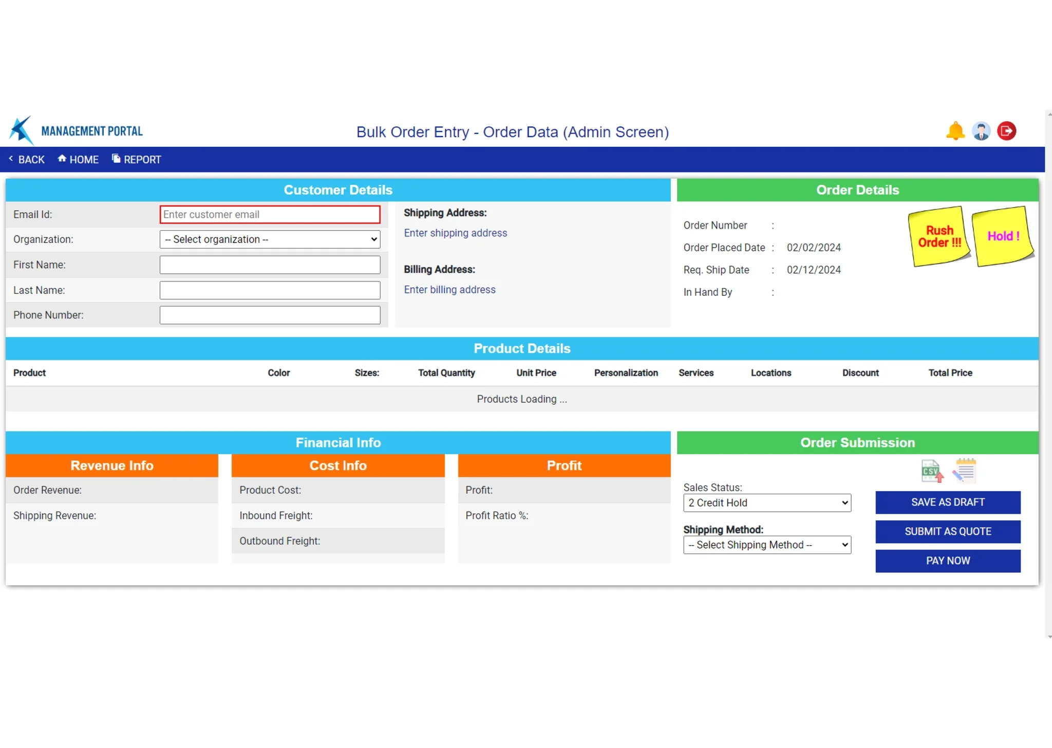
The original order entry dashboard — cramped layout, no visual hierarchy, no product thumbnails, and no path to editing without navigating away.
- Cramped layout with no clear information hierarchy
- No visual product reference — thumbnails or otherwise
- Very low contrast with no built-in affordances
- Unlinked, non-functional assets (sticky notes in the corner)
- Revenue and margin data occupying primary real estate
- Clean, compartmentalized layout with efficient information display
- Product thumbnails and color swatches inline in the dashboard view
- Branded UI assets communicating available actions clearly
- Nested, scrollable hub for checkout, billing, and shipping info
- Autofill for repeat client contact details
The Problem
A Dashboard Built by People Who Never Had to Use It
The existing order entry tool had no shortage of information — it just presented almost none of it in a way that served the people who needed to process orders multiple times a day. High-priority real estate was occupied by profit margins and revenue insights: useful for stakeholders and operations leads, but secondary noise for account managers completing the actual entry tasks.
Users described the experience as "half dashboard, half digital labyrinth." The specific failure points were consistent across every person interviewed.
Discovery
Process Mapping Revealed the Foundation Was Already There
I ran a loosely structured discovery workshop with stakeholders, account managers, and the operations team to map the end-to-end order entry process, understand business objectives, and surface specific pain points from the people completing the work.
The most surprising output of that session was near-universal agreement that the design wasn't architecturally broken — it was poorly organized and poorly prioritized. Everyone felt the foundation for a modular, self-contained dashboard was present. The frustration was in the execution: information was scattered, the illusion of modularity meant constant external navigation, and the tool had been designed by people who never needed to input an order.
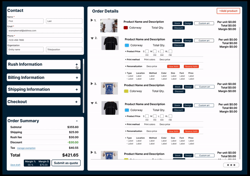
The most important information for processing orders was the detailed product overview — sizes, print locations, methods, and art files. It was relegated to a single line of text. Users had to scroll, then navigate away, just to confirm what was in the order they were building.
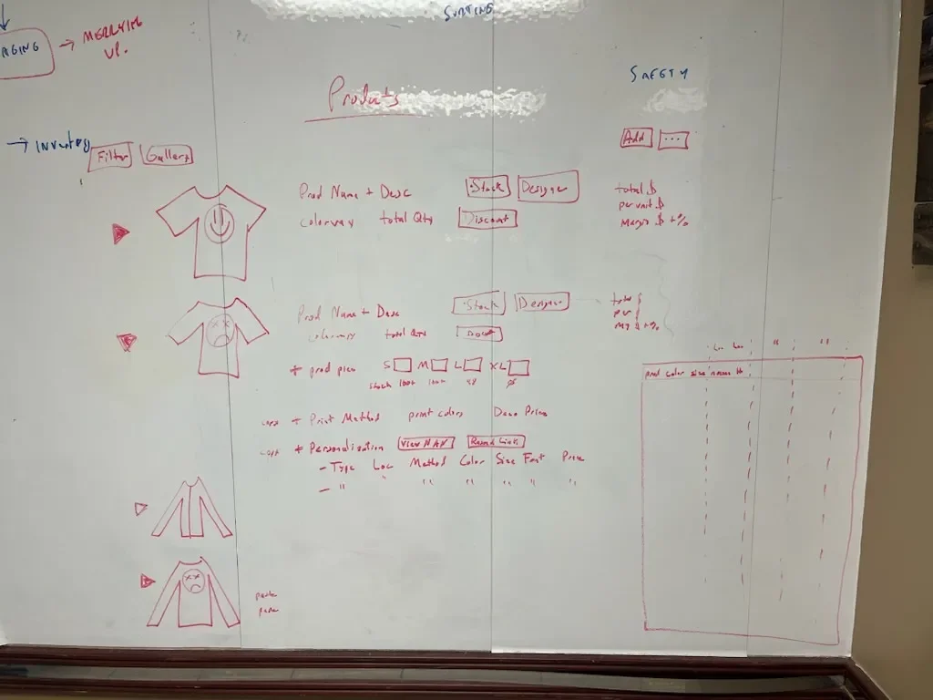
Workshop output — process mapping surfaced three distinct categories of information required for end-to-end order entry: client information, product details, and accounting data.
That taxonomy became the structural foundation for the redesign. The workshop also confirmed the scope: no glaring omissions or wholesale restructures were required. This was a reorganization, not a rebuild — closer to solving a puzzle than drafting a blueprint.
The Design Challenge
Consolidate Without Losing the Detail That Makes Orders Processable
Custom apparel orders require a higher density of confirmed detail than most e-commerce workflows. The dashboard couldn't just simplify — it had to contain complexity more intelligently, surfacing the right information at the right moment without requiring users to navigate externally to find it.
Spring sports season was approaching and order volume was climbing. That timeline shaped the approach: this wasn't a project with runway for extended research cycles. The team knew what they needed. The design work had to move fast and stay sharp.
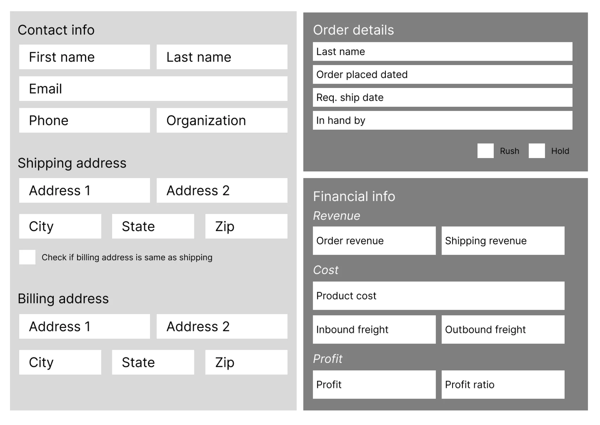
Early wireframe pass — establishing the bifurcated layout with product detail as the dominant content area and a contained left column for checkout, billing, and client info.
Design Decisions
Four Sprints, Four Iterated Designs
I ran four weekly sprints with the dev team, stakeholders, and key users to iterate and test as the design developed. The sprint cadence was intentional — with Spring season coming and order volume climbing, there was no runway for a slow rollout. Everyone needed to be aligned through the design phase so handoff could happen cleanly on the other side.
Prototype walkthrough — the self-contained product detail dropdown and left-column checkout hub in action.
Order editing and product detail interactions — all contained within the dashboard view without external navigation.
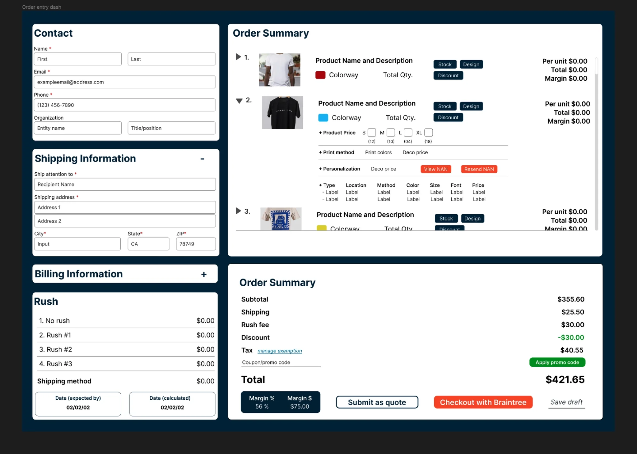
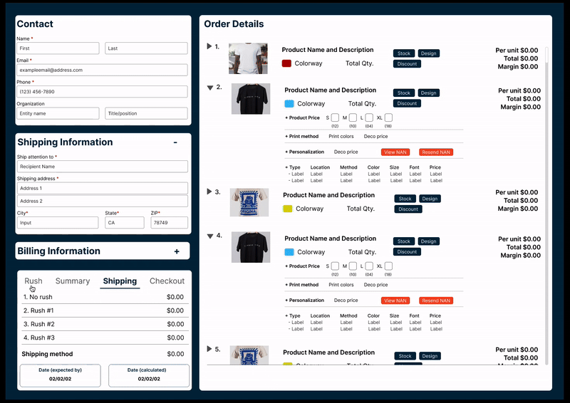
Final high-fidelity design — product thumbnails, expandable detail rows, and a consolidated checkout panel all accessible without leaving the view.
UI System
Branded Components Across an Expanding Scope
Part of the original scope of work I signed on for involved updating the visual language and brand presence for the platform at large — and as it turned out, that work was just as needed for the internal tools as it was for the client-facing experience. The accessibility and contrast issues in the original dashboard weren't incidental; they were a symptom of a visual system that hadn't been given deliberate attention.
To keep the internal tool in harmony with the client-facing brand refresh, I implemented the same typography and color decisions I had been developing for the broader platform. Lato was selected as the base typeface for its slimline, economical use of space without sacrificing legibility at the density this dashboard required. Deeper blues and brand oranges were used to signify CTAs and available interactions — a consistent signal language across both sides of the product.
The particulars of the color system and interaction signifiers are under NDA, but the principle was consistency: the same visual logic that told a customer what to do next needed to tell an account manager the same thing on their side of the platform.
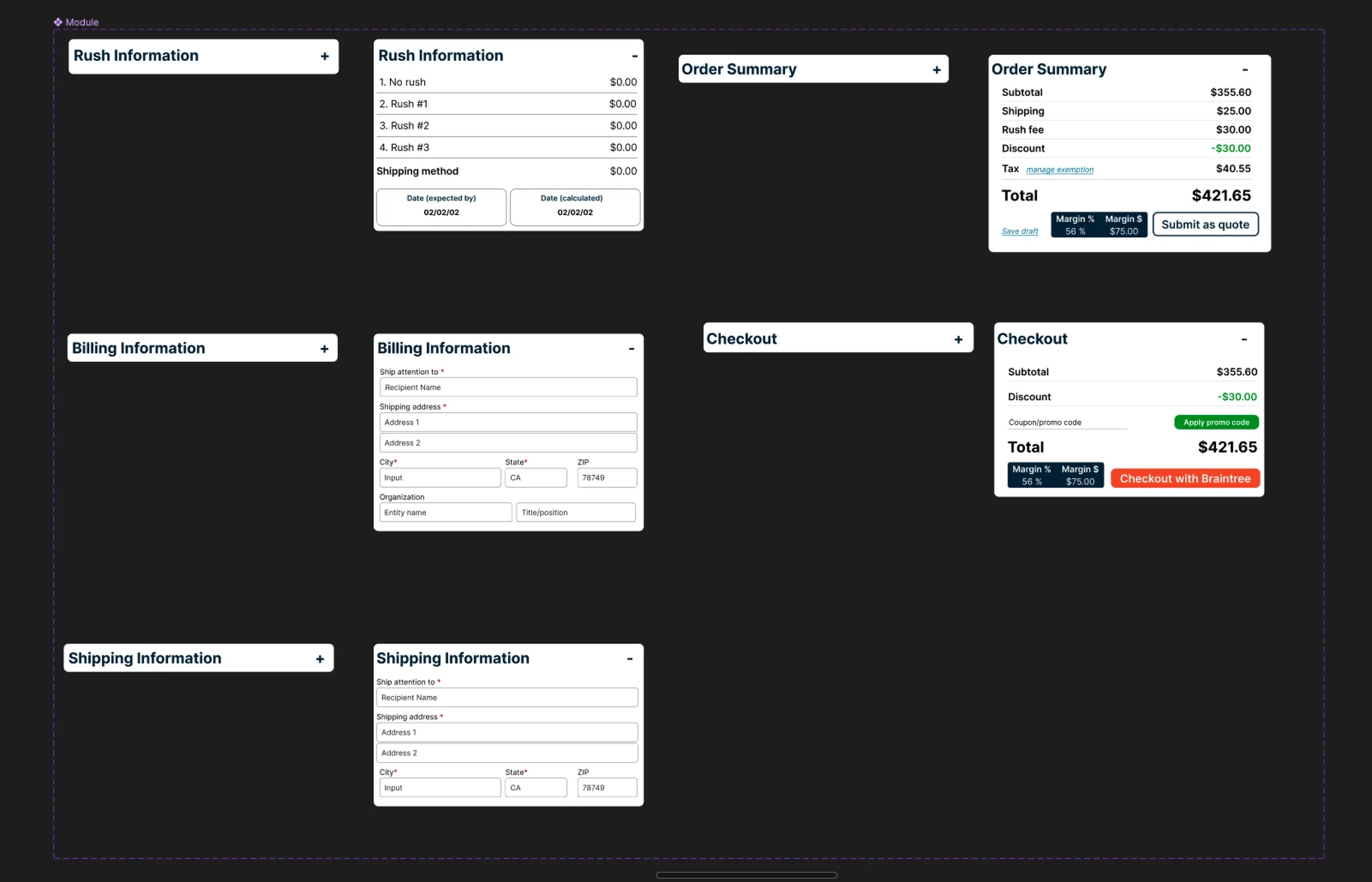
Branded UI component set — buttons, status indicators, and action affordances aligned with the platform-wide brand refresh.
Outcome
40% Reduction in Processing Time, Four Weeks to Rollout
The redesigned dashboard reduced order entry processing time by 40%. Contained product dropdowns, inline thumbnails and color swatches, and consolidated checkout eliminated the navigational overhead that had been compounding across every single order.
Handoff was clean. The dev team had been present in every sprint, so there were no surprises at the transition point. The dashboard was built on an Angular framework with Tailwind CSS components and rolled out in four weeks.
Some external reroutes remain for genuinely complex interactions — repositioning a print file's location requires the dedicated product editor, and that complexity belongs there. The design was honest about that ceiling rather than forcing those interactions into a view that couldn't support them well. The reroutes that remained were intentional. The ones that were eliminated were the ones that never needed to exist.
View Figma Prototype →Reflection
What This Project Demonstrates
This was a fast project — two months from zero to shipped — and the conditions that made it fast were real. The problem was legible, the foundation was structurally sound, and the team had a clear enough sense of what they needed that extended discovery would have been more ceremony than substance.
That clarity is worth examining rather than taking for granted. The order entry team knew the tool was broken because they used it every day. The workshop surfaced specifics, but nobody needed three months of stakeholder archaeology to understand that forcing account managers to navigate to individual product pages just to confirm what was in an order was costing everyone time.
Users understand their practical constraints better than any brief will
My original instinct was to default to having the checkout window as the static, always-open view — the last step in the process should be ready to go. It made sense architecturally. It was wrong operationally.
Users referenced the order summary most frequently throughout the entry process, not at the end of it. They didn't want to keep expanding a sub-menu to access information they needed constantly. That reframe only happened because users were in the room — and because I was willing to let their workflow supersede my intuition about what the "right" state should be.
Not every project requires a comprehensive research phase to produce a good outcome
Sometimes the team knows what they need, the foundation is already there, and the most valuable thing a designer can do is move quickly, involve the right people in the iteration, and make sure what ships is elegant, intelligent, and on time.
Would I have loved protected time for extended strategy sprints? Always. But the instinct to front-load research regardless of context is its own kind of rigidity. Reading the project correctly — knowing when to go deep and when to go fast — is part of the work.